Crafting a Brand From the Bun Up
Sometimes there’s really nothing that hits the spot quite like a good old-fashioned burger. Here at Launch, we like burgers as much as the next guy, and we were more than happy to partner with Texas burger chain Chapps Burgers to relaunch their brand. We sat down with Dave Wilgus, Launch Principal, to learn more about the rebranding process.
WHAT WAS THE GOAL OF THE CHAPPS REBRAND?
Chapps Burgers, family-owned and operated for 34 years, spans 7 restaurants in the DFW metroplex and has a history of making great-tasting hamburgers. The family owners wanted to franchise their business and came to Launch to help them re-launch the Chapps brand. Our goal was to create an engaging brand story and cohesive brand experience that would attract new customers and franchise investors alike.
WHAT WAS THE DESIGN INSPIRATION BEHIND THE INTERIOR DECORATION AND BRANDING?
Customers told us that Chapps’ amazing burgers, quality ingredients and fair prices kept them coming back for more. Chapps’ long history of doing things right and treating people like family made them a Texas burger institution. The simple traits that made Chapps successful became our inspiration. We created a brand that embodied their strong work ethic and passion for making a great tasting burger. We started with a graphic look and feel we call “Blue Collar Cool.” Classic and industrial in tone, the design direction takes its cues from an era of vintage craftsmen, when baseball tickets, painted signs and union logos were works of art. The voice of the brand is a common sense, no B.S. attitude delivered with likable, relatable wit and humor.
HOW ARE THESE ELEMENTS COMMUNICATED BOTH IN-STORE AND ON THEIR WEBSITE?
We try to use all customer touch points to get people to engage with the Chapps brand and tell our unique story. Starting in-store, we took advantage of every available square inch, down to the napkin holders. The new restaurant interior design incorporated the primary brand colors and graphics direction – modern industrial tone with a touch of vintage warmth. We used a white brick wall behind the order counter to hand paint brand graphics that tell the Chapps story and communicate our brand values. The new menu hanging above the counter reflects the modern vintage graphic look and feel of the brand with language that speaks to the quality of our ingredients and long history.
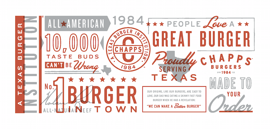
Chapps Burgers Wall Mural
We created five eye-catching posters with bold photography and smile-worthy headlines to help people understand what makes a Chapps burger so special.
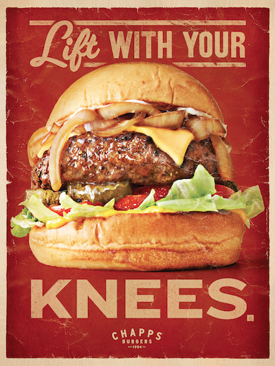
Chapps Burgers Poster Art
Packaging is another important way to tell our story in and out of the store environment. We used simple, recycled materials to make bags, boxes, and cups that continued the vintage graphic look and fun, memorable messaging.
The Chapps website gave us the opportunity to give people a big picture overview of everything the brand stands for starting with our history and the belief of the family patriarch that “we can make a better burger.” Mouth-watering photography paired with humorous headlines and copy feels warm and welcoming. Even if you’ve never visited a Chapps in person, you’ll understand how we became a Texas Burger Institution.
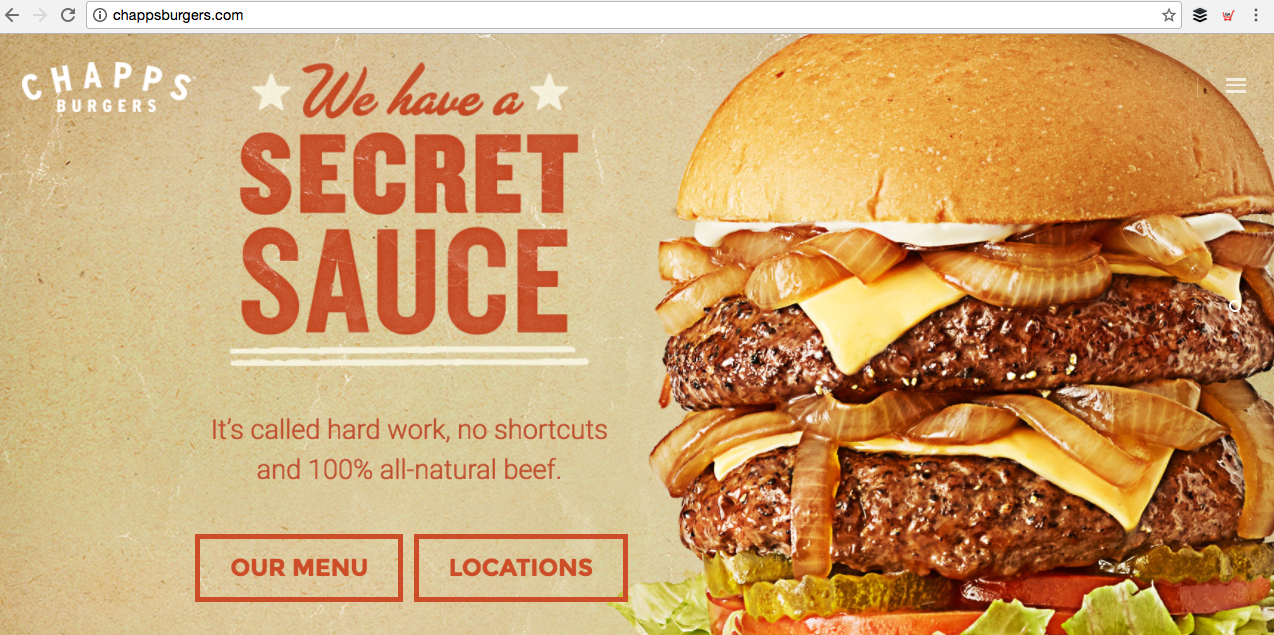
Chapps Burgers Website Homepage
WHAT WAS THE MOST CHALLENGING ASPECT OF THE REDESIGN?
Our limited budget was somewhat challenging but we were able to find ways, including more affordable printing techniques and materials, to communicate the brand story in-store and online.
WHAT WAS THE MORE REWARDING ASPECT OF THE REDESIGN?
Seeing the final results of all our work in the first Chapps remodeled store gave us all great satisfaction. And hearing that store sales were up – even better!