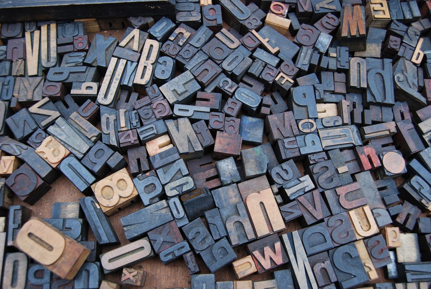
Meet our resident sketch artist
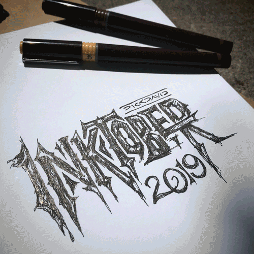
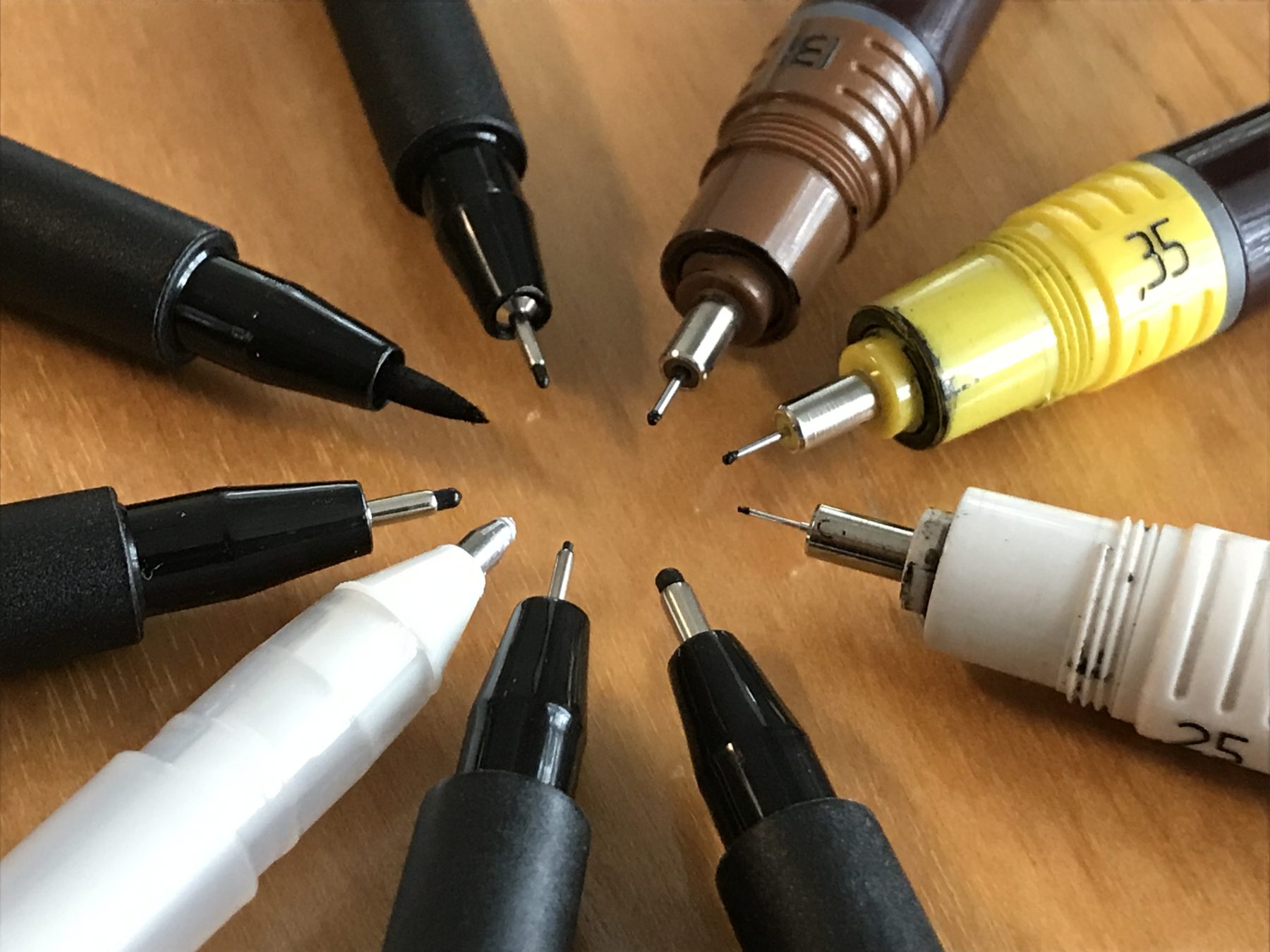
You might say Launcher, Richard Wezensky is a little obsessed with sketching. After all, he’s been drawing for the past 31 days as part of Inktober, a social challenge that gives you a different prompt every day to inspire a different illustration for the entire month of October. But Richard’s had a pencil in his hand way before that. Recently, we sat down with him to find out what drives all this doodling.
What inspired you to start drawing?
After the HOW Design Conference, where I was inspired by many great industry leaders, I decided to take some analog breaks from my digitally driven days and just make things.
How do you fit sketching into your schedule?
I try to give my best time to myself—which is usually in the mornings. Sometimes, I get so into a sketch, that I take some of my lunch or evenings to finish. Occasionally, inspirations will strike and I find myself starting a rough sketch between layouts. I always keep my sketchbook available for when that happens.
What keeps you going?
Sketching makes me extremely happy. I almost forgot the joy making something for myself. It’s certainly a nice way to break out of a creative rut and it’s even more satisfying when I see other folks getting inspired to make things.
How do you think sketching helps you be a better art director?
This creative reset has given me a fresh perspective on the projects that I work on for my clients. I’m open to try more visually challenging solutions.
How does your future sketch out?
I’ve always had a desire to create a graphic story—perhaps one about riding my bike, which is my other passion.
Which artists or illustrators inspire you?
I follow a lot of great illustrators on Instagram. Among them, Jake Parker, who started Inktober – a grassroots challenge for artists to improve their drawing skills. I just finished participating in that challenge, which happens throughout the month of October – 31 days, 31 drawings.
Why do you dig drawing so much?
I truly love doing this because a ‘maker’ has to make. The greatest side effect is seeing people around me starting to make things as well. I shared a great evening with my son, where we just sat at the kitchen table, drawing together.
Have you received any high fives, awards or pats on the back for your work?
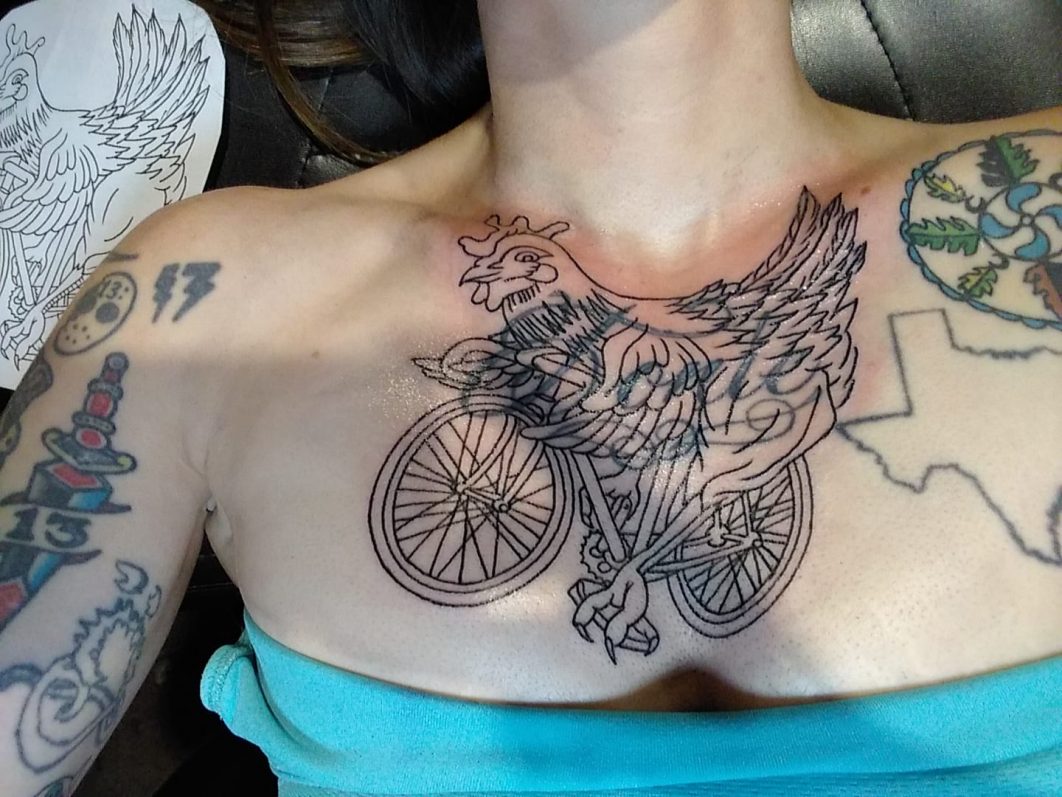
I was offered to do a show, but I’m only working out of a sketchbook, so I really don’t have anything to display yet. I’ve also picked up a couple of commissions, which I thought would never happen. And maybe the most surprising thing that’s happened is that one of my drawings became a tattoo. On a person I’ve never met. Kinda flattering in a weird way.
 Whitney Museum collateral, c/o Grafik
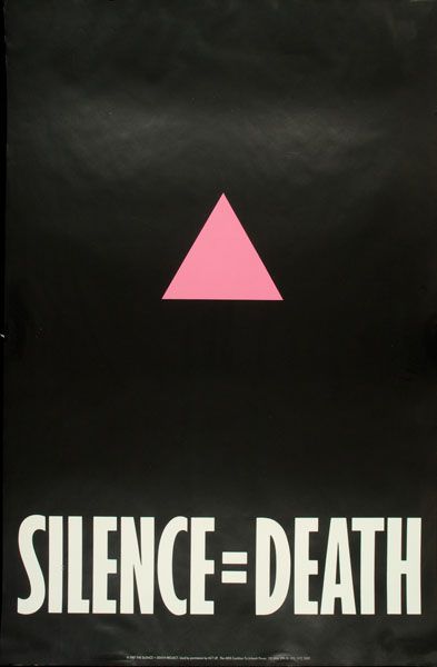 “Silence = Death” AIDs poster, created by Avram Finklestein, Brian Howard, Oliver Johnston, Charles Kreloff, Chris Lione, and Jorge Soccaras, c/o ACT UP
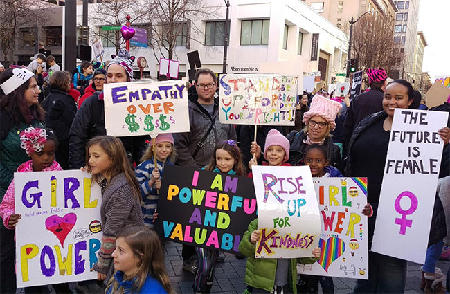 Seattle Women’s March, c/o Edith B. and A Mighty Girl
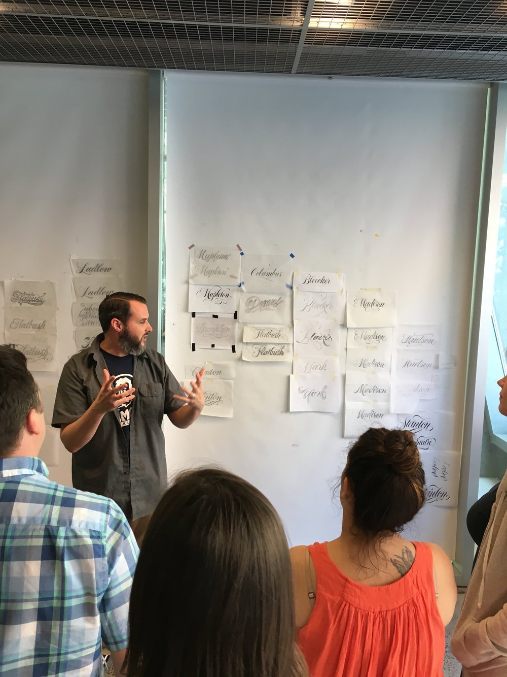 Ken Barber leading the class
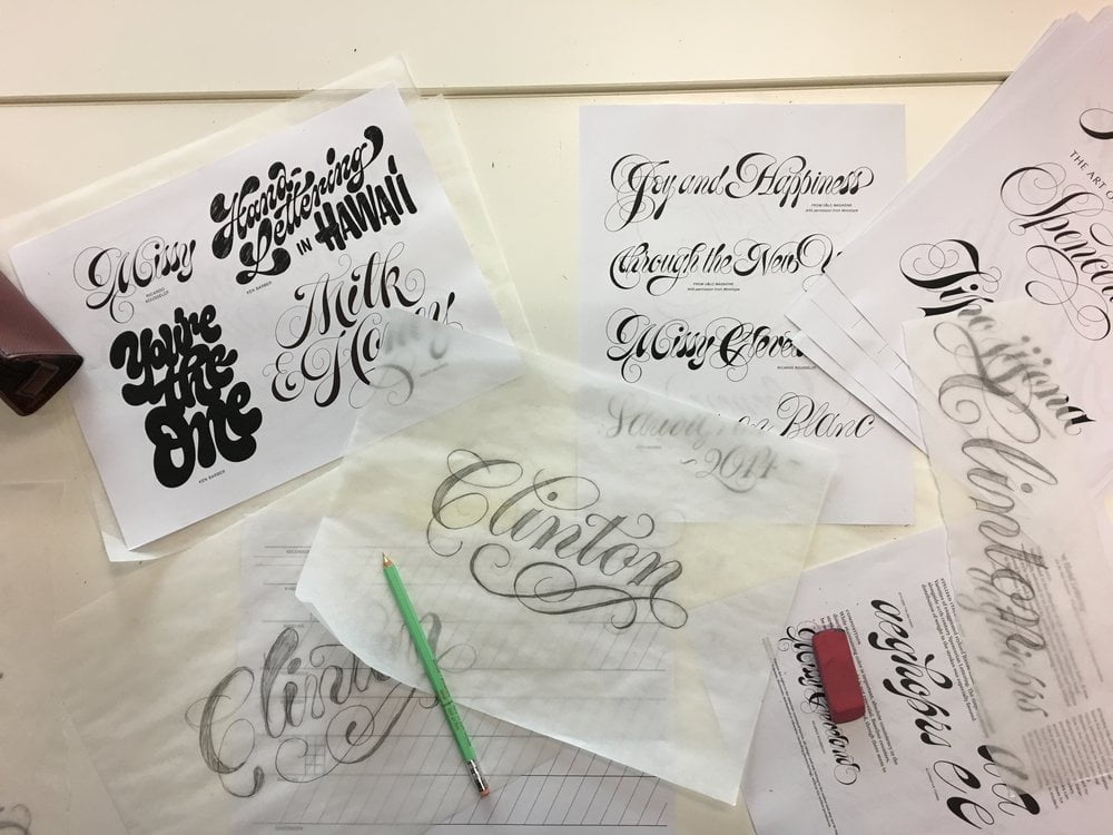
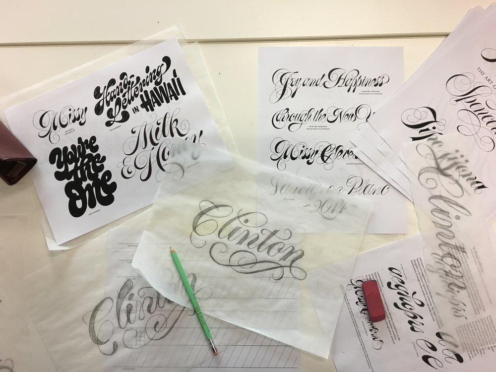 Some lettering examples

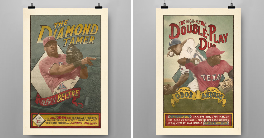
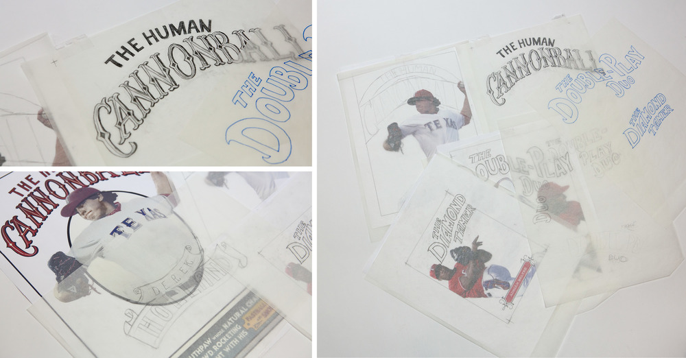
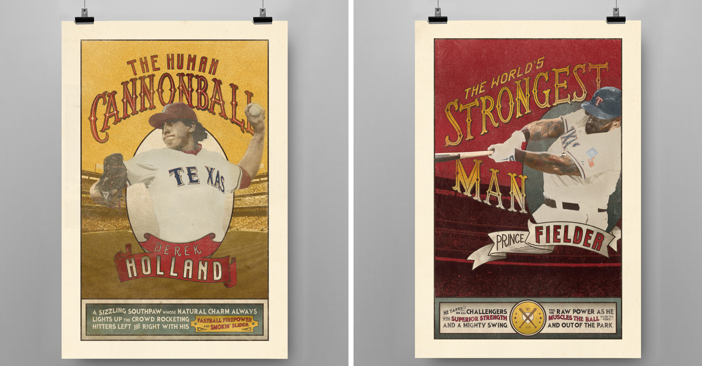 Every year, the Texas Rangers and Park Place Dealerships host the Triple Play Game Show Spectacular, a themed charity dinner featuring a star lineup from the Rangers’ roster. For this year’s “vintage circus” theme, Launch created a series of posters that cast the spotlight on these larger-than-life baseball players. The look and tone were heavily inspired by circus posters from the late 19
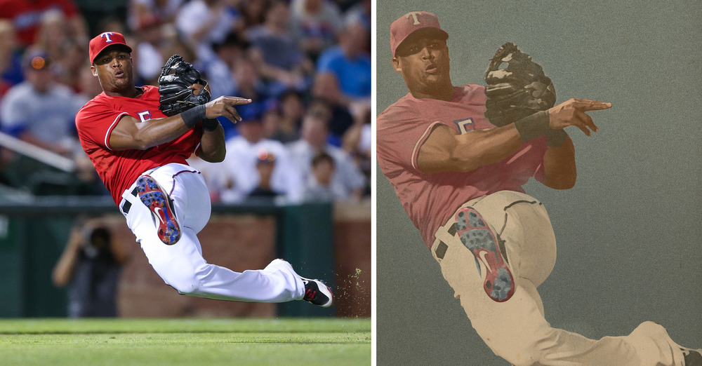 One of the most gratifying parts of the project was when the Rangers requested another printed round of posters because the players wanted their own copies. It’s neat to think that these superstar athletes are going to have our artwork hanging in their homes! Art Director Carolyn Sexton had the opportunity to meet Derek Holland at this year’s event and he was extremely complimentary of the posters.
“I could barely manage to mutter out a ‘thank you’ and was too star-struck to even get a picture with him,” says Carolyn. “You live and learn. Next time, Derek.”
One of the most gratifying parts of the project was when the Rangers requested another printed round of posters because the players wanted their own copies. It’s neat to think that these superstar athletes are going to have our artwork hanging in their homes! Art Director Carolyn Sexton had the opportunity to meet Derek Holland at this year’s event and he was extremely complimentary of the posters.
“I could barely manage to mutter out a ‘thank you’ and was too star-struck to even get a picture with him,” says Carolyn. “You live and learn. Next time, Derek.”
 Carolyn Sexton, Art Director/Designer/Letterer
Alex Slotkin, Associate Creative Director/Writer
Lauren Coleman, Digital Retoucher
David Wilgus, Creative Director
Rebecca Lauten, Senior Account Executive
Texas Rangers/Park Place Dealerships, Client
Carolyn Sexton, Art Director/Designer/Letterer
Alex Slotkin, Associate Creative Director/Writer
Lauren Coleman, Digital Retoucher
David Wilgus, Creative Director
Rebecca Lauten, Senior Account Executive
Texas Rangers/Park Place Dealerships, Client