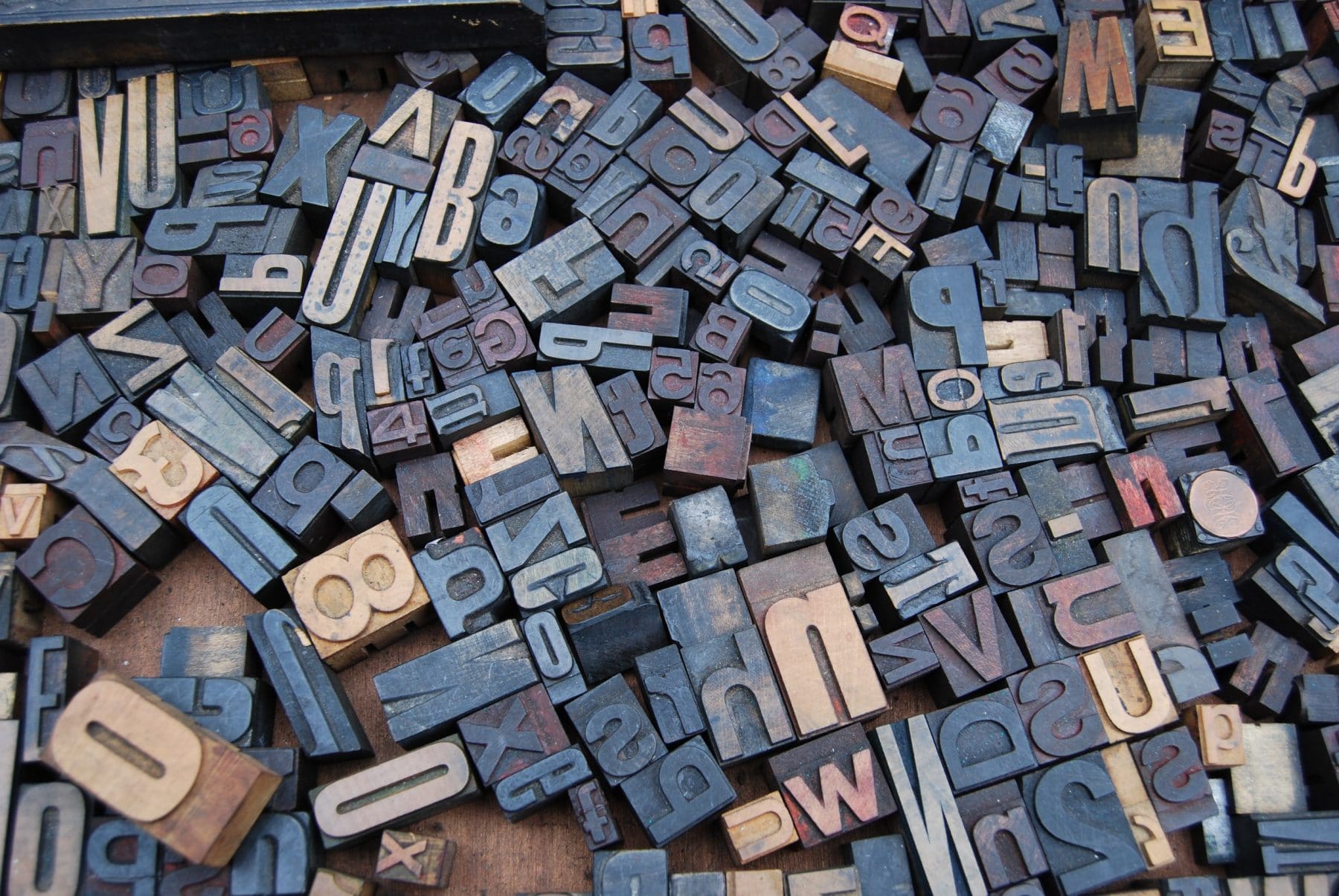
We sat down with Art Director Carolyn Sexton to pick her brains and learn about some of her favorite fonts:
Let me start by saying that I hate “favorites” lists. I am extremely indecisive and the thought of having to pick my favorite movie, band, or even food is a daunting task. Can’t I have a million favorites?
Sitting down to write about my Top 5 Favorite Fonts was no different. In order to narrow the selection, I’ve decided to focus on my current favorites—what I seem to be using the most of right now, at this very moment. Here it goes, in no particular order:
“A Gotham for every occasion” is no understatement. There is an array of weights and widths to fit your every need. It works well for headlines, body copy, logos, anything – seriously, anything. What I like most about Gotham is its legibility. There’s a geometric quality to it that reaches beyond the grid.
I like Brandon Grotesque for a lot of the same reasons I like Gotham. It’s open, easy to read, and functional across multiple applications. However, there’s something a little more friendly and approachable about Brandon Grotesque. The shortened x-height and the way the letterforms have been optically corrected are some of the contributing factors.
Inspired by Baskerville, Mrs Eaves is a transitional serif typeface. The wide letter-spacing and low x-height make it unique among other serifs. I like to use it as text or supporting type. It feels fancy and familiar. #imsofancy #youalreadyknow
My passion for calligraphy and hand-lettering leads me to my next fave. Rolling Pen is fluid, overly simple, and just delightful. I want my own handwriting to look like this. The delicate swashes and alternates add a sense of excitement and elegance. I’ve been having a lot of fun incorporating it into invitations.
Burford is a vintage display font that resembles European signage. What makes this font so cool is all the different layering options. The base is beautiful all by itself, but it really starts to come alive when you combine multiple layers. The possibilities are endless!
Well that does it for my Top 5 Favorite Fonts at This Moment in Time. If you ask me next month, I’m sure they’ll be different. But please don’t ask me because I’ll have to spend 4 hours thinking about it.