Typographics Festival: An Art Director’s Experience
Art Director Carolyn Sexton recently had the opportunity to attend the Typographics design festival in New York City, centered around contemporary typography. The midpoint of the festival is a 2-day conference that bridges together two weeks of workshops and tours. With a more specific audience and only being in its third year, all attendees were able to fit in the Great Hall at The Cooper Union. Although the physical environment was on a smaller scale compared to other conferences she’s attended, there was not a lack of energy, wisdom or inspiration. “The next two days were a whirlwind,” says Carolyn. “I heard over 20 speakers from all over the world discussing topics on graphic design and type design. Each talk was only 30 minutes and you could tell that the presenters felt a little rushed, but I took away a lot in just half an hour.” Check out a few of Carolyn’s favorites from the panels below:
 Whitney Museum collateral, c/o Grafik
“It’s not Helvetica, and other facts about designing for the Whitney”
by Hilary Greenbaum, Whitney Museum of American Art Hilary spoke about the rebranding of the Whitney Museum and how her small team of in-house designers has maintained and established the identity system through an array of marketing, print materials, digital media, exhibition graphics, and signage. The challenges are very similar to those Launch faces with long-standing client, Park Place Dealerships. Substitute museum exhibitions with luxury car manufacturers and dealerships, and you have the same concept of creating consistency across the brand. She talked about how to push your design within the “rules,” and how sometimes you have to be willing to break your own guidelines.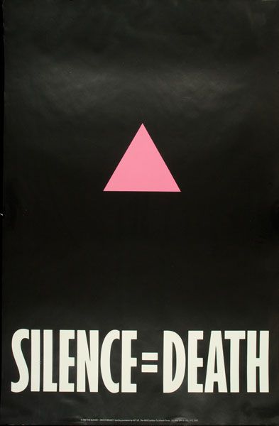 “Silence = Death” AIDs poster, created by Avram Finklestein, Brian Howard, Oliver Johnston, Charles Kreloff, Chris Lione, and Jorge Soccaras, c/o ACT UP
“Resist Typography”
by Marlene McCarty Marlene explored how typography is used in political and social activist movements. Decades ago, protest posters utilized great design and branding. They were clean, simple and had a sense of uniformity. This can be seen in the AIDS marches during the 1980s. However, the posters of more recent years have seen a shift away from branding because of the subliminal association with big business and advertising. Now more than ever we have the digital tools to create well-designed activist posters and signage, but we’re choosing to create something handmade. Just look at posters from the Women’s March. The message was unified but was communicated a hundred different ways with a hundred different mediums. This desire for authenticity has bled into the advertising world, where brands want personal connection with their customers and don’t want to be perceived as too corporate.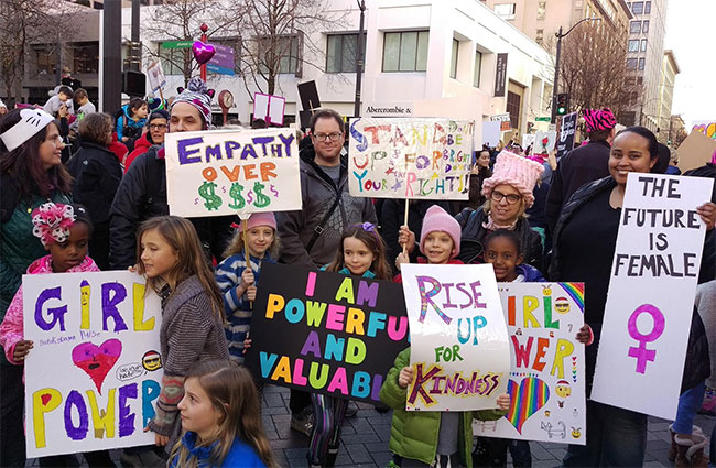 Seattle Women’s March, c/o Edith B. and A Mighty Girl
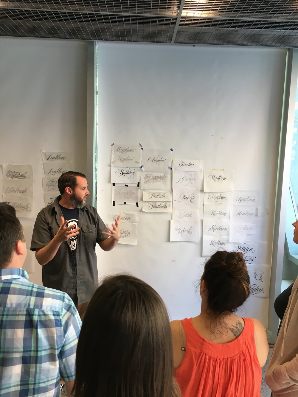 Ken Barber leading the class
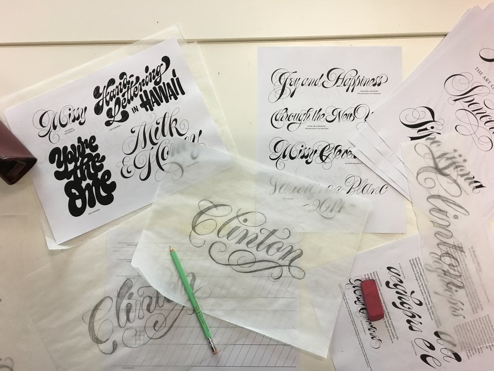
Spencerian Letter Workshop
by Ken Barber Following the conference, Carolyn took a 2-day workshop on Spencerian Letter with Ken Barber. “This was probably the highlight of my trip,” she says. “Leading up to the workshop, I was geeking out over the newly released ‘House Industries’ book that Ken co-authored. To say I had high expectations for the workshop would be an understatement, and Ken did not disappoint. He was extremely knowledgeable and encouraging. I learned a ton about this extravagant lettering style, as well as other tips and tricks I can apply to future projects.”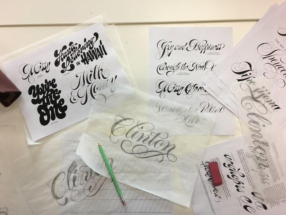 Some lettering examples