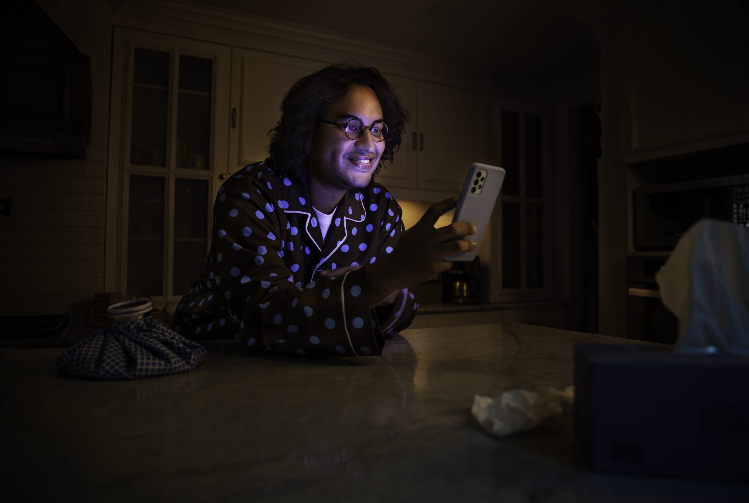
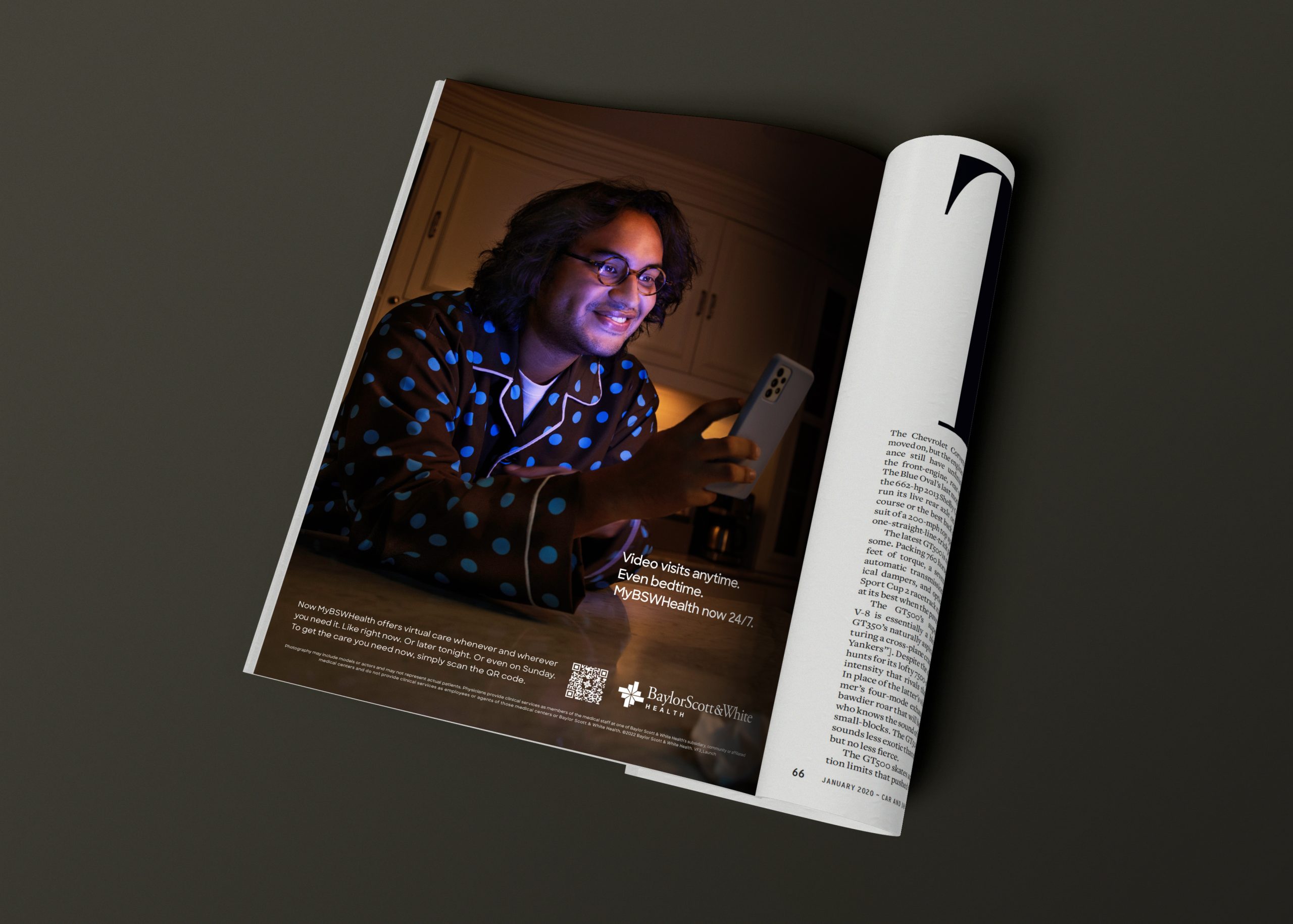
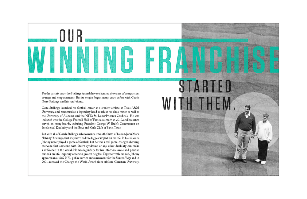
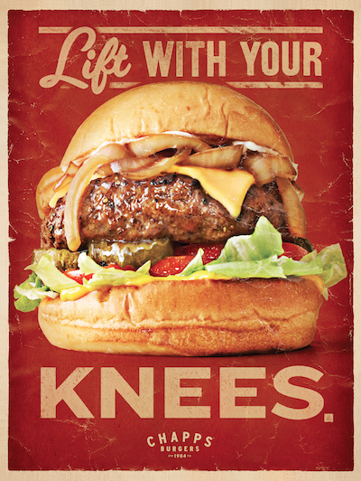
Get care now. Like now, now.
To announce the news that the MyBSWHealth app now connects you to Baylor Scott & White Health 24/7, we partnered with award-winning director Eli Green to create a series of charming spots focusing on what happens when we get sick after hours or on weekends––you know, times when the doctor’s office is usually closed.
From frantically searching the internet for clues to creating less-than-appetizing homeopathic remedies, we see real-life scenarios get solved by simply connecting patients with the expert physicians at MyBSWHealth.
“Urgency is a tricky message in humor. With a hint of levity and character performance, we found a tone that connects need and relatability for Baylor Scott & White Health,” said Eli Green of Cultivate Media.
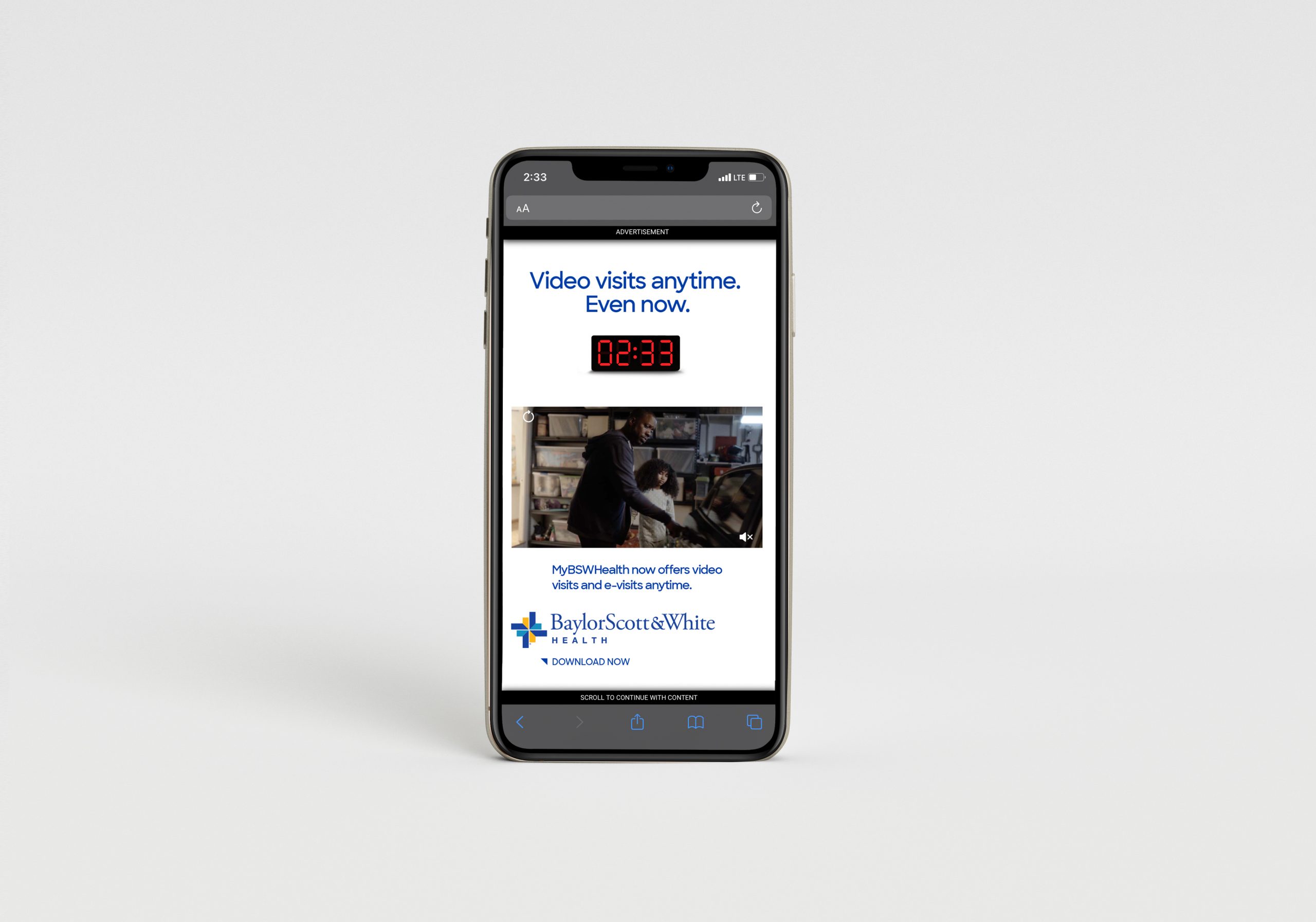
The television commercials launched during Dallas Cowboys games and even mention that you can get care during the game. Digital and social executions feature actual clocks that call out the exact time they are running to emphasize you can get care right this very minute. And airport OOH speaks to the fact that you can get care right now between flights.
By correlating with the times and places you can get care through the MyBSWHealth app, this charming campaign hopes to empower patients across Texas to get the care they need whenever they need it. Like right now. Later today. On weekends. At the airport. In the grocery store. You get the idea…
The campaign is running in North and Central Texas on television, print, OOH and social platforms like Snapchat, Instagram and Facebook.
CREDITS:
Client: Baylor Scott & White Health
Director: Eli Green, Cultivate Media
Executive Producer: Paul Papanek, Cultivate Media
Producer: Carlos Ayami, The Lift
Line Producer: Pablo Chozas, The Lift
Photographer: Brigette Diez
Principal/Creative Director: David Wilgus, Launch Agency
Principal/Creative Director: Diane Seimetz Duncan, Launch Agency
Creative Director/Art Director: Brian Dedering, Launch Agency
Creative Director/Copywriter: April Steinbach, Launch Agency
Producer: Jaime Roderer, Launch Agency
Account Director: Jason Giles, Launch Agency
Management Supervisor: Megan Lucy Neal, Launch Agency
Client: Ben Day, Director of Creative, Baylor Scott & White Health
Editor: Adam Henderson, Charlie Uniform Tango
Sound Design: Jake Kluge, Charlie Uniform Tango
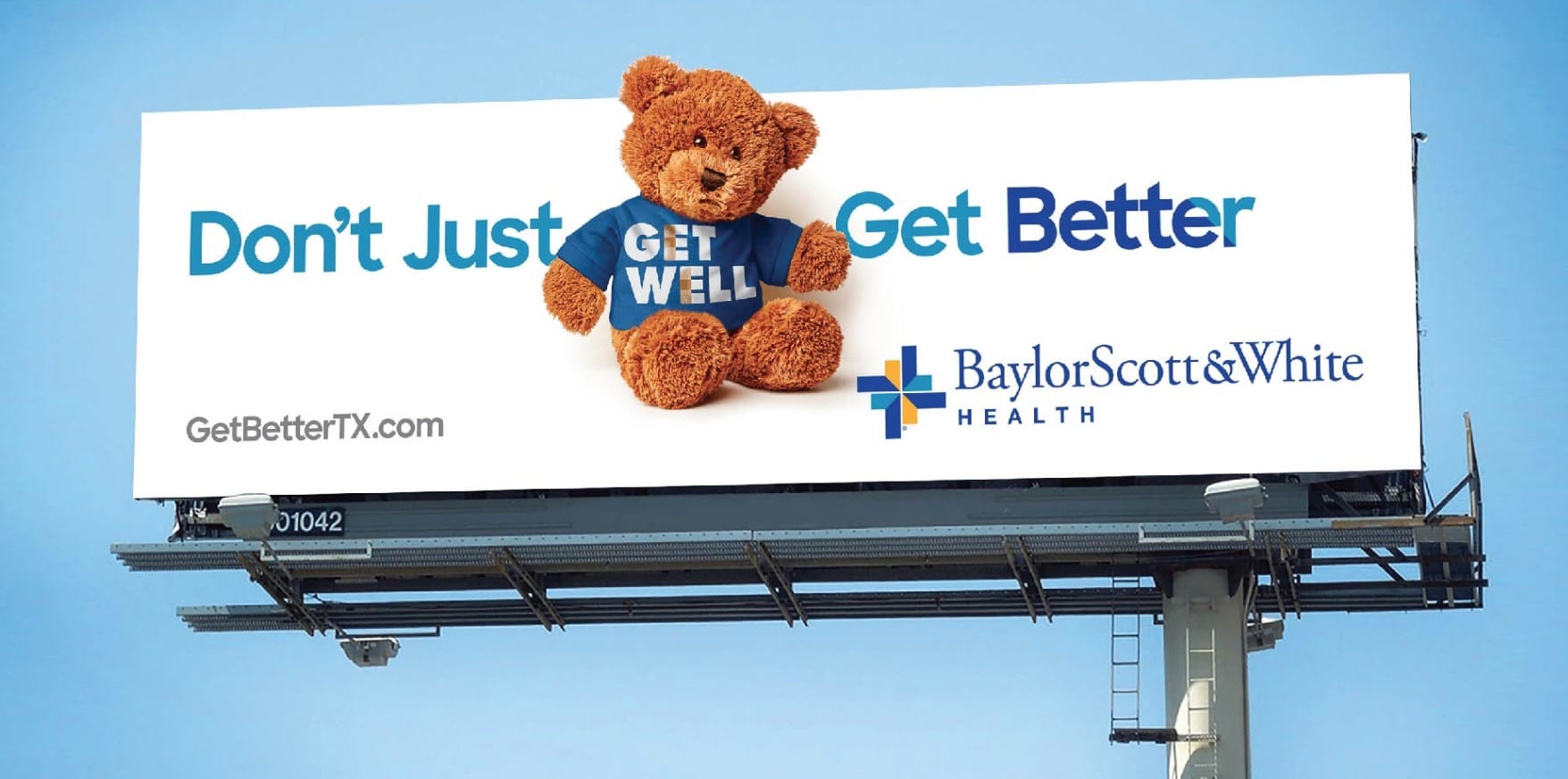
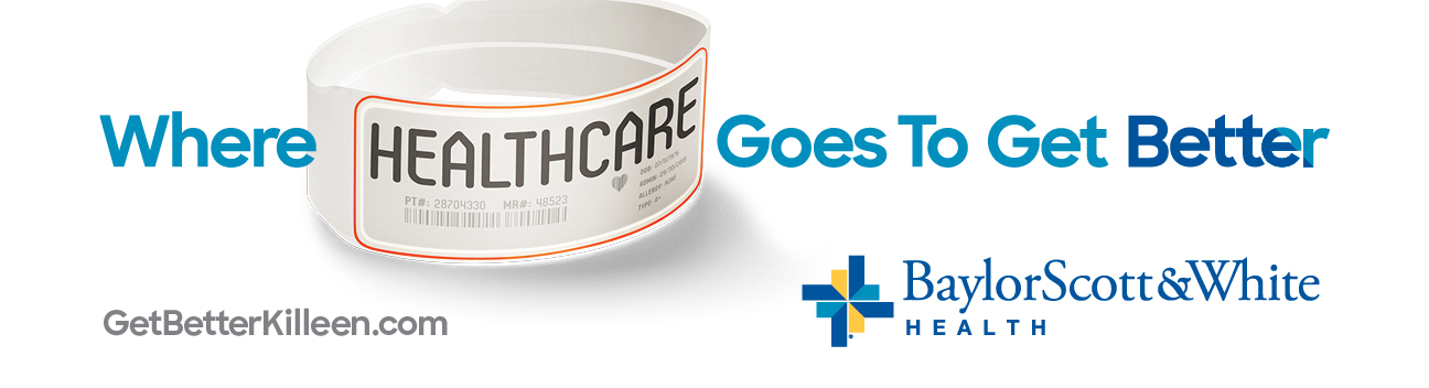 Out-of-home board
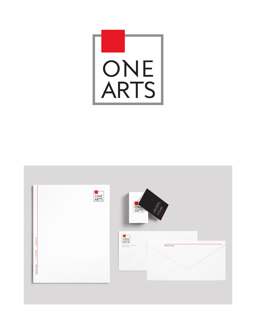
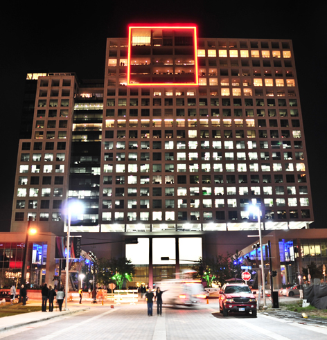 One Arts Plaza
“The updated typeface is reminiscent of the original but bolder,” says Carolyn Sexton, Launch Senior Art Director. “We added angled strokes off certain letters in the name to lend energy and a sense of playfulness. We also retained the neon red square, an icon on the Dallas skyline, resulting in an evolution that melds heritage with a clean, modern twist.”
One Arts Plaza
“The updated typeface is reminiscent of the original but bolder,” says Carolyn Sexton, Launch Senior Art Director. “We added angled strokes off certain letters in the name to lend energy and a sense of playfulness. We also retained the neon red square, an icon on the Dallas skyline, resulting in an evolution that melds heritage with a clean, modern twist.”


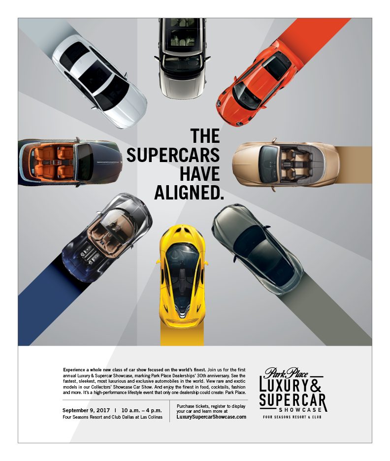 Guests arrived at the
 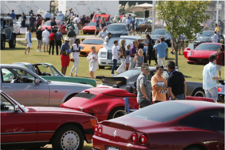 The results of the event itself surpassed all expectations – $30,000 was donated to the

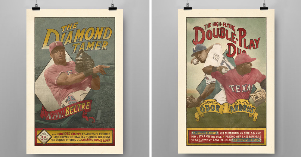
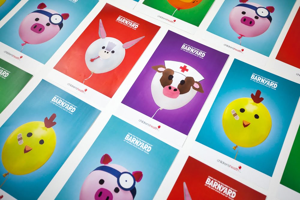
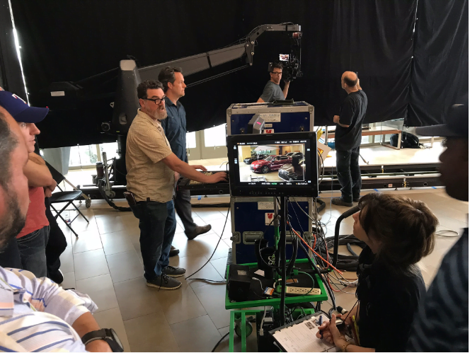
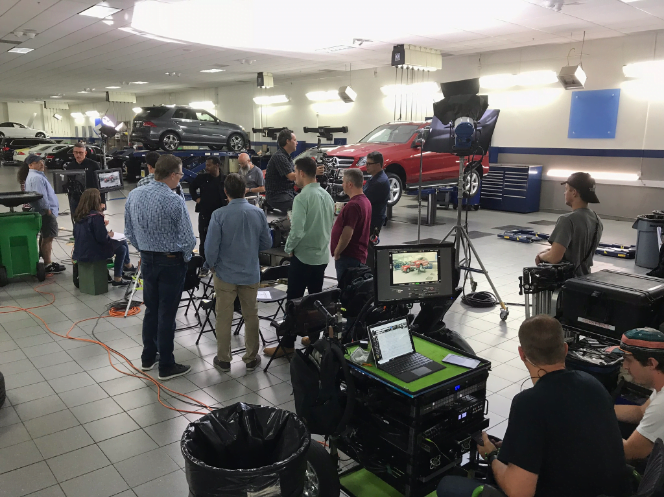
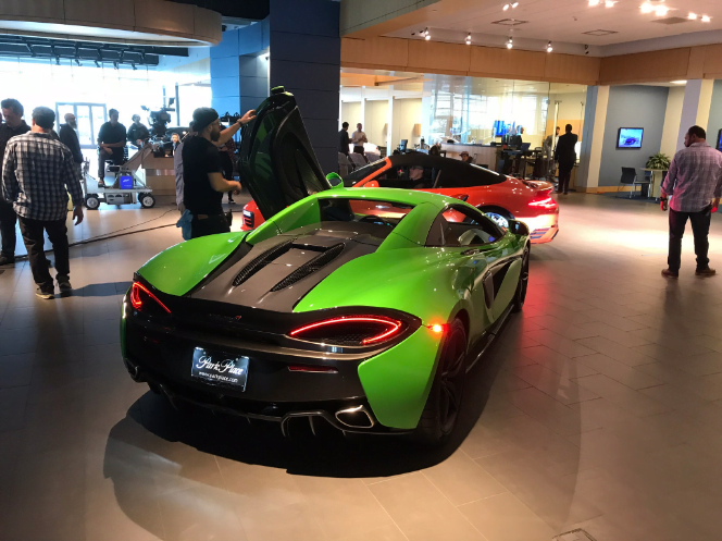
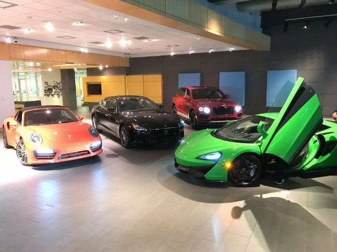
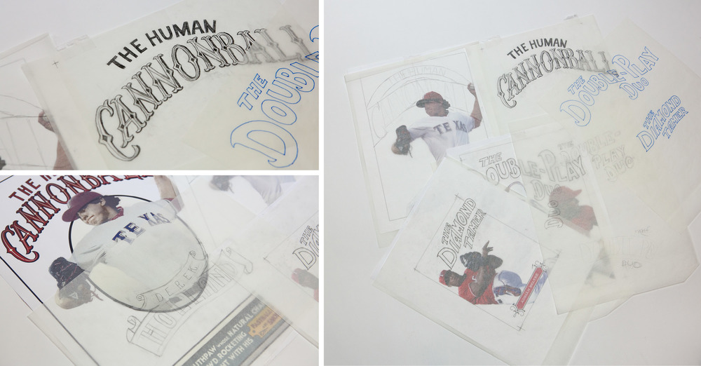
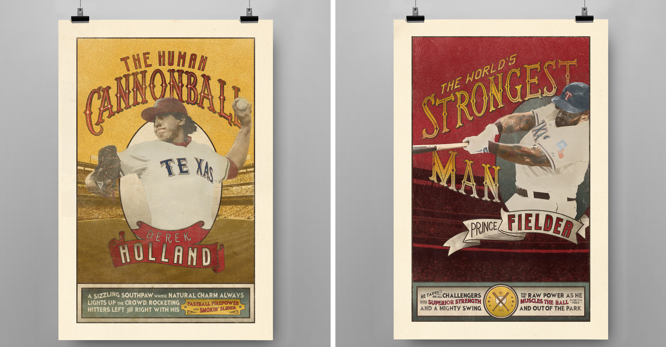 Every year, the Texas Rangers and Park Place Dealerships host the Triple Play Game Show Spectacular, a themed charity dinner featuring a star lineup from the Rangers’ roster. For this year’s “vintage circus” theme, Launch created a series of posters that cast the spotlight on these larger-than-life baseball players. The look and tone were heavily inspired by circus posters from the late 19
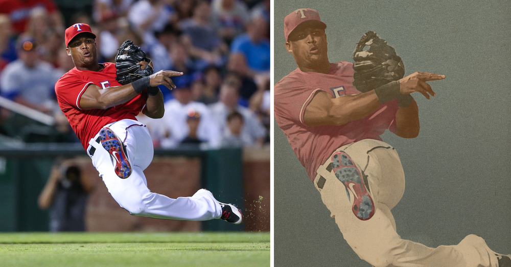 One of the most gratifying parts of the project was when the Rangers requested another printed round of posters because the players wanted their own copies. It’s neat to think that these superstar athletes are going to have our artwork hanging in their homes! Art Director Carolyn Sexton had the opportunity to meet Derek Holland at this year’s event and he was extremely complimentary of the posters.
“I could barely manage to mutter out a ‘thank you’ and was too star-struck to even get a picture with him,” says Carolyn. “You live and learn. Next time, Derek.”
One of the most gratifying parts of the project was when the Rangers requested another printed round of posters because the players wanted their own copies. It’s neat to think that these superstar athletes are going to have our artwork hanging in their homes! Art Director Carolyn Sexton had the opportunity to meet Derek Holland at this year’s event and he was extremely complimentary of the posters.
“I could barely manage to mutter out a ‘thank you’ and was too star-struck to even get a picture with him,” says Carolyn. “You live and learn. Next time, Derek.”
 Carolyn Sexton, Art Director/Designer/Letterer
Alex Slotkin, Associate Creative Director/Writer
Lauren Coleman, Digital Retoucher
David Wilgus, Creative Director
Rebecca Lauten, Senior Account Executive
Texas Rangers/Park Place Dealerships, Client
Carolyn Sexton, Art Director/Designer/Letterer
Alex Slotkin, Associate Creative Director/Writer
Lauren Coleman, Digital Retoucher
David Wilgus, Creative Director
Rebecca Lauten, Senior Account Executive
Texas Rangers/Park Place Dealerships, Client