Rallying The Troops For Your Brand
The advertising war room – far less aggressive than it sounds (although there are occasional battles within) – is Strategy Central at Launch. It’s here we conduct a full brand audit and assessment of “enemy” territory. What are our client’s greatest strengths? How well does their product or service differentiate itself in a sea of sameness? Vital insights are drawn here, insights critical to informing the planning process.
We discussed the role and history of the war room with Launch partners and Creative Directors Diane Seimetz and Dave Wilgus:
What exactly is a Launch War Room?
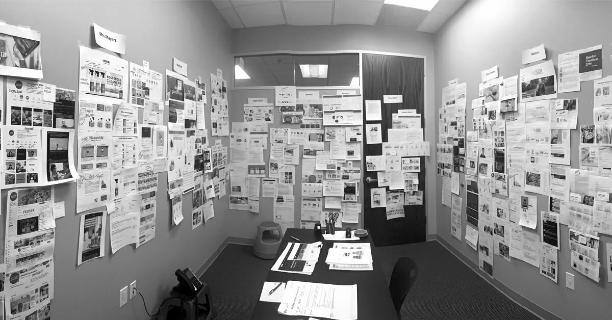
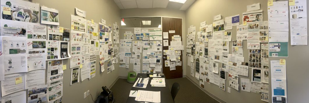
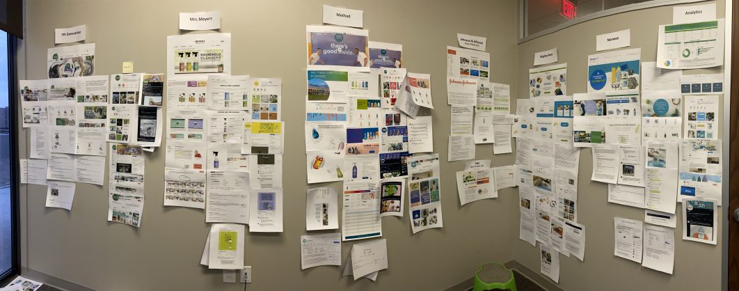
It’s one of the few truly private places in the agency…no windows, a real door to close. We find this helps our squirrel-prone brains to focus. Inside, the walls are covered with pinnable material, which becomes home to a wide variety of our client’s and their competitors’ marketing, brand and social media assets, online reviews – almost anything digital and physical we can unearth. In the end, it’s a 360-degree deep dive, providing a unique, all-in-one glimpse into the customer experience.
What led Launch to establish this practice?
Surveying the competitive landscape has always been intrinsic to our discovery process. While we think we know what the others in the category are saying and doing, our recollections can be dated, confused or just not the case. Things change quickly in the world of consumer brands, and there’s really no substitute to ensure you’re working off the latest information than gathering it for yourself. We felt that designating a dedicated space to collect, view, compare and share this intel would encourage and facilitate this key effort.
What do clients gain from this process?
A date with the War Room is always a highlight of the brand strategy process. Our clients are extremely busy, and they appreciate this unique glimpse into their customer’s journey – all under one roof. It’s immersive, interactive, and has impact.
How does a war room get built?
It really does take an army to locate/source the large amount of content required to outfit the effort. A typical war room can include everything from website pages, Instagram feeds, video, print and promotional samples, menus, packaging, paid digital, search. We have people who have become expert at organizing this content on the walls in an easy-to-understand way.
Do you have any tips for building an effective War Room?
The key is to represent all relevant channels, so you get a really good idea of each brand’s story, who they are targeting, how they are attempting to position themselves, how they talk about their company, mission, unique benefits. It also helps to have at least one tall person on your team to pin things nice and high on the wall:)
How else does Launch fight the good fight for clients?
Spending time learning what’s going on in the competitive space is just one of the many ways we prepare to go to war for our clients. It’s part of our four-stage Launch Sequence® that combines strategic process with creative prowess.
Building a powerful brand starts with insights as the foundation, which inspire work that’s relevant, engaging and meaningful. Often highly entertaining, too. Creativity used in this way is the marketer’s ultimate trump card, prevailing over clutter to cut-rate pricing.
Memorable, shareable ideas not only differentiate a brand, they drive its success.


 Out-of-home board


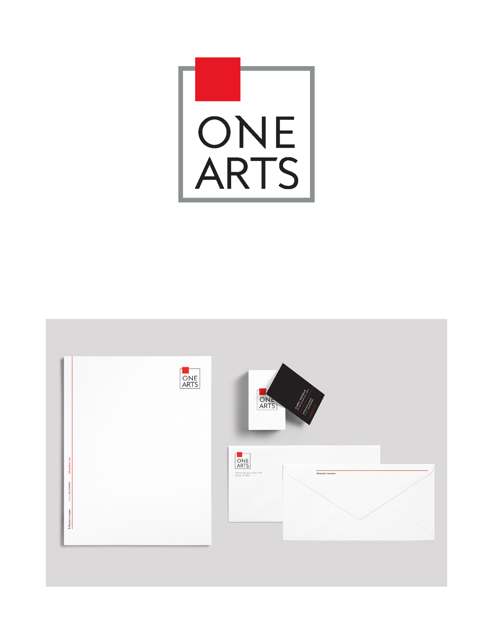
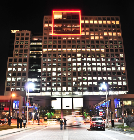 One Arts Plaza
“The updated typeface is reminiscent of the original but bolder,” says Carolyn Sexton, Launch Senior Art Director. “We added angled strokes off certain letters in the name to lend energy and a sense of playfulness. We also retained the neon red square, an icon on the Dallas skyline, resulting in an evolution that melds heritage with a clean, modern twist.”
One Arts Plaza
“The updated typeface is reminiscent of the original but bolder,” says Carolyn Sexton, Launch Senior Art Director. “We added angled strokes off certain letters in the name to lend energy and a sense of playfulness. We also retained the neon red square, an icon on the Dallas skyline, resulting in an evolution that melds heritage with a clean, modern twist.”


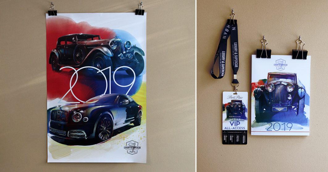
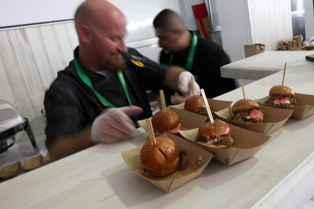
 Guests arrived at the
  The results of the event itself surpassed all expectations – $30,000 was donated to the